


 The U.S. stock market has been painting a subtle picture recently. While the broader indexes, such as the S&P 500 ($SPX), Nasdaq Composite ($COMPQ), and Dow Jones Industrial Average ($INDU), are indeed grinding higher, the daily movements have been relatively subdued. This is a noticeable shift from the more dynamic action we observed in April.
Investors may be waiting for Wednesday’s May Consumer Price Index (CPI), the results of the U.S.-China trade talks, or the next market-moving news headline. What’s encouraging is the underlying strength in market breadth. We’re seeing a healthy number of one-month new highs across most broader indexes (with the exception of Dow Utilities), Bullish Percent Indexes signaling bullish tendencies, and investors gravitating toward offensive sectors vs. defensive ones.
On the surface, everything points to a continuation of the bullish trend. However, as astute investors, our primary objective is to protect our capital. This means we mus always consider the possibility of a downside correction and be prepared to adapt.
This is where the StockCharts Market Summary page becomes an indispensable tool for your market analysis.
Let’s dive into how the Market Summary page can help you gain a unique perspective on market dynamics.
Beyond the Headlines: Uncovering Global Trends
One of the powerful features of the Market Summary page is its ability to provide a global snapshot. If you navigate to the Global Snapshot tab in the Equities panel and sort the “+/- SMA(200)” column in descending order, you’ll notice something fascinating: the Eurozone occupies the top spot while the Total US sits at the bottom (see image below).
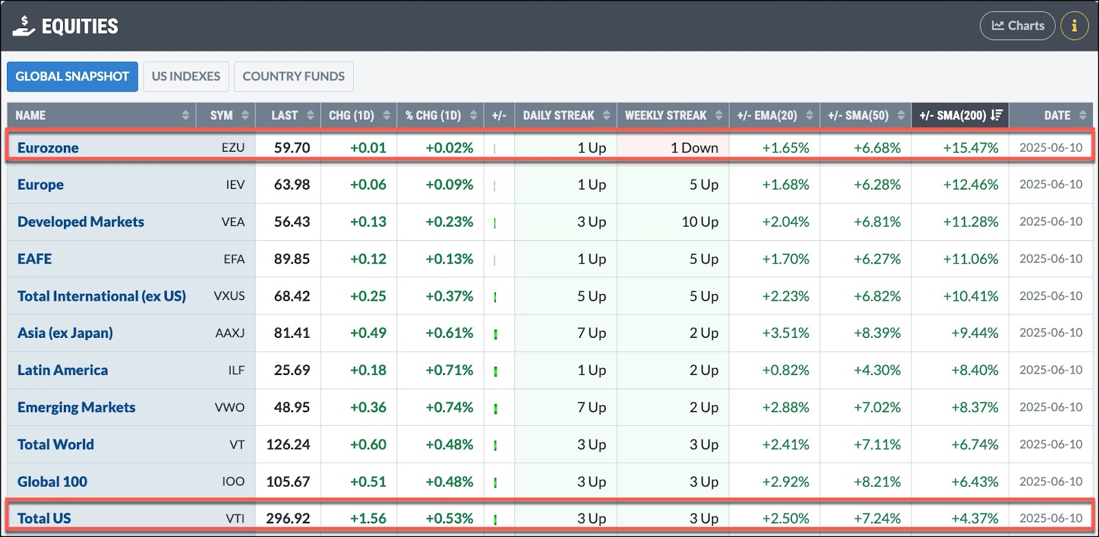
FIGURE 1. A GLOBAL SNAPSHOT. The Eurozone is trading well above its 200-day simple moving average (SMA) while the Total US is only 4.37% above its 200-day SMA.Image source: StockCharts.com. For educational purposes.
This insightful view suggests that global markets have been trending well above their 200-day simple moving average than the US market. This insight is worth a deeper dive.
Consider the daily charts of the iShares MSCI Eurozone ETF (EZU) and Vanguard Total Stock Market ETF (VTI) which serve as proxies for these regions.
Since April 8, EZU has been on a steep ascent, demonstrating upward momentum. This price action is similar to the S&P 500, but if you consider the relative performance of the SPDR S&P 500 (SPY) vs. EZU, SPY is underperforming EZU (see bottom panel in the chart below).
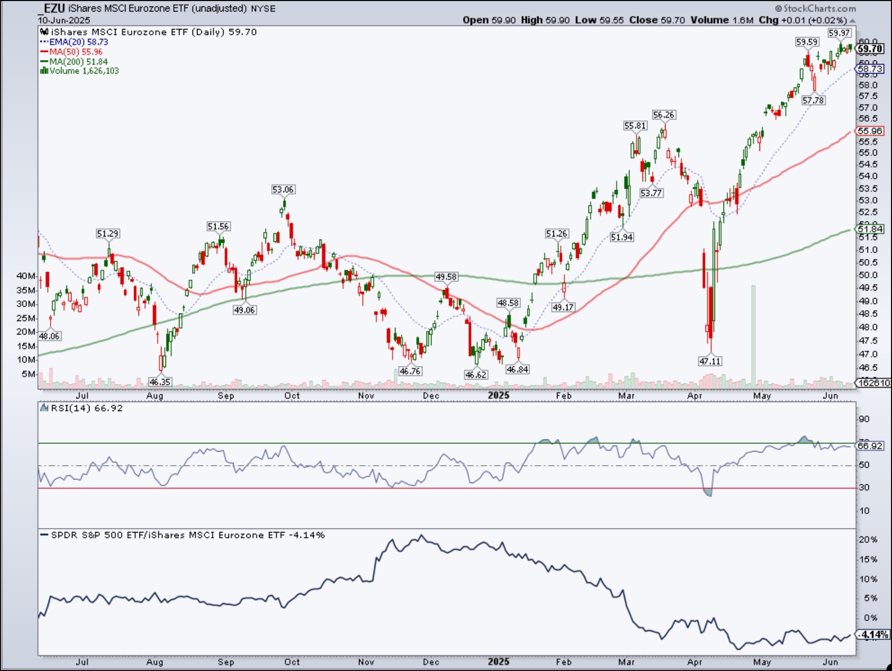
FIGURE 2. DAILY CHART OF EZU. The ETF is exhibiting a steep ascent and is outperforming SPY. Will the trend become less steep or continue its steep uptrend? Be sure to monitor the RSI.Chart source: StockCharts.com. For educational purposes.
The Relative Strength Index (RSI) is showing lackluster momentum. Generally, a steep trend loses its mojo after a while and reverts to a more normal trend.
Meanwhile, though VTI has also moved higher, its percentage rise was slightly less than EZU. Also, as EZU hit an all-time high, VTI is still trying to reach that milestone (see chart below).
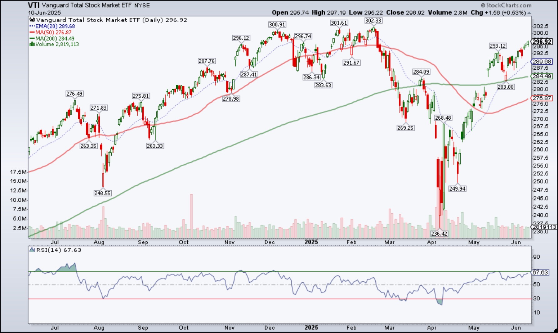
FIGURE 3. DAILY CHART OF VTI. The ETF is also exhibiting a steep ascent but is trying hard to reach its all-time high.Chart source: StockCharts.com. For educational purposes.
The RSI is showing lackluster momentum, similar to that of EZU, which could mean the steep ascent may be losing its steam.
Identifying Global Opportunities
It will be interesting to see how the global financial market evolves from here. Who will be the first to revert to a more normal sloping trend? Will EZU continue its outperformance, or will VTI take the lead?
And let’s not forget the global ETFs positioned in the middle of the pack. Regions like Asia (ex Japan), Latin America, or Emerging Markets could take the lead. For example, the Vanguard FTSE Emerging Markets ETF (VWO) has exhibited a more classic uptrend. Over the past year, it has outperformed SPY by around 127% (see chart below). The RSI is also showing greater momentum than the other charts we analyzed.
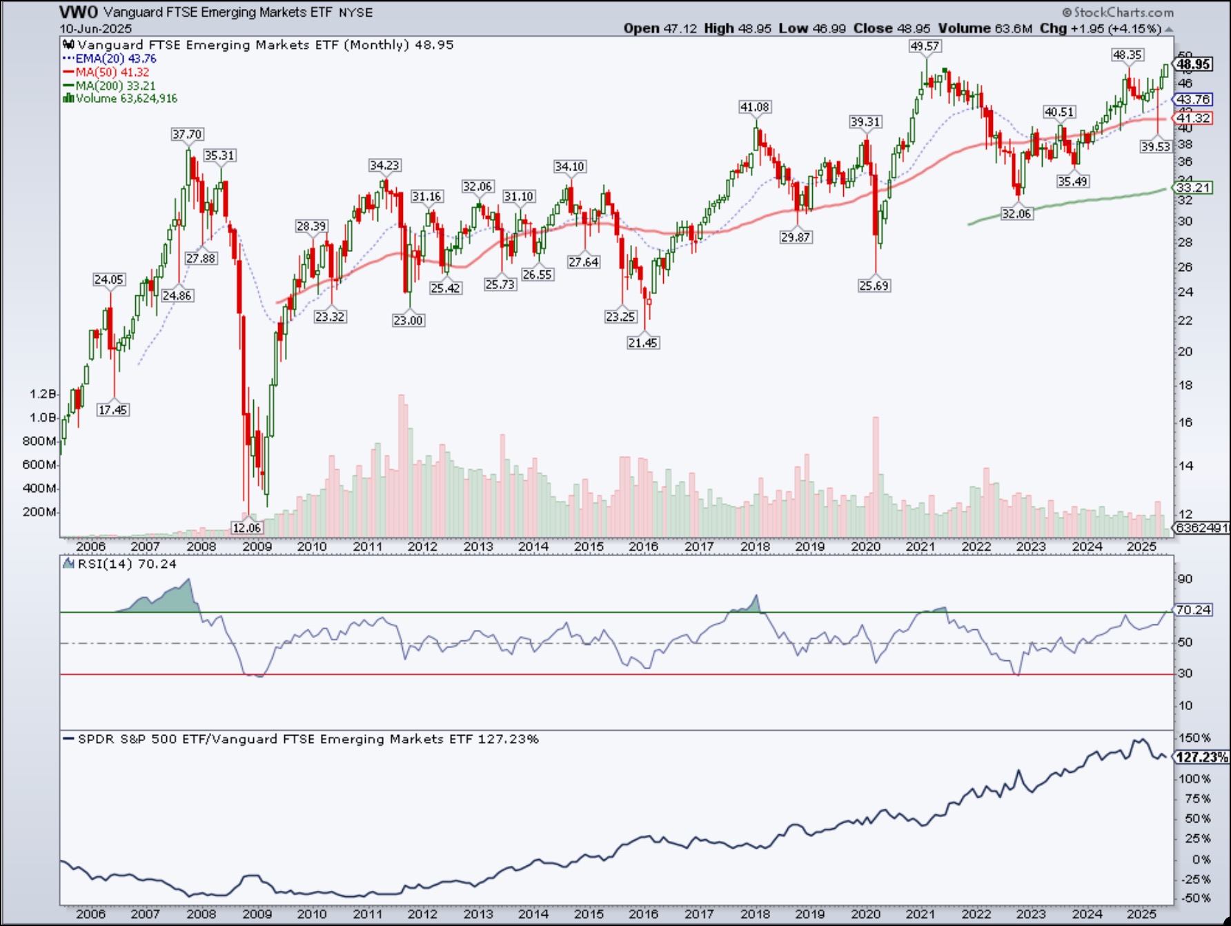
FIGURE 4. DAILY CHART OF VWO. This ETF is exhibiting a more normal uptrend and, over the last year, has outperformed SPY by a whopping 127%. RSI is also rising, suggesting there could be momentum here.Chart source: StockCharts.com. For educational purposes.
Empowering Your Stock Market Analysis
To stay ahead of market trends and uncover hidden gems, investors and traders should regularly monitor the charts in the Market Summary ChartLists. If you haven’t already, download the StockCharts Market Summary ChartPack (it’s free for subscribers).
Scrolling through the pre-built ChartLists will help you to:
- Stay on top of the market’s price action across sectors, industries, and global regions.
- Identify market internals, such as breadth and sentiment.
- Uncover some hidden gems that could translate into favorable investment opportunities.

Disclaimer: This blog is for educational purposes only and should not be construed as financial advice. The ideas and strategies should never be used without first assessing your own personal and financial situation, or without consulting a financial professional.